How to Read Candlestick Charts: A Complete Forex Trading Guide

When you open a trading platform for the first time, the colored candles jumping up and down on your screen can feel confusing and overwhelming. Most beginners focus on the price numbers and miss what candlesticks are actually telling them. This is a critical mistake because candlestick charts contain far more information than any other chart type.
A candlestick shows you four important prices all at once: where the market opened, where it closed, the highest point it reached, and the lowest point it touched during that period. This complete picture reveals the story of a trading period in a way that simple line charts cannot. Understanding candlesticks is the foundation of technical analysis in forex trading.
This guide teaches you everything a beginner needs to know about candlestick charts. You will learn what each part of a candlestick means, how to spot important patterns, and how professional traders use them to make trading decisions. By the end, reading candlestick charts will feel natural and automatic.
Table of Contents
- What Exactly is a Candlestick Chart?
- The Four Parts of Every Candlestick
- Understanding Green Candles and Red Candles
- What the Wicks Tell You About Price
- Real World Example: Reading EUR/USD Price Action
- The Most Important Candlestick Patterns
- How to Spot Trends Using Candlesticks
- Mistakes Most Beginners Make
What Exactly is a Candlestick Chart?
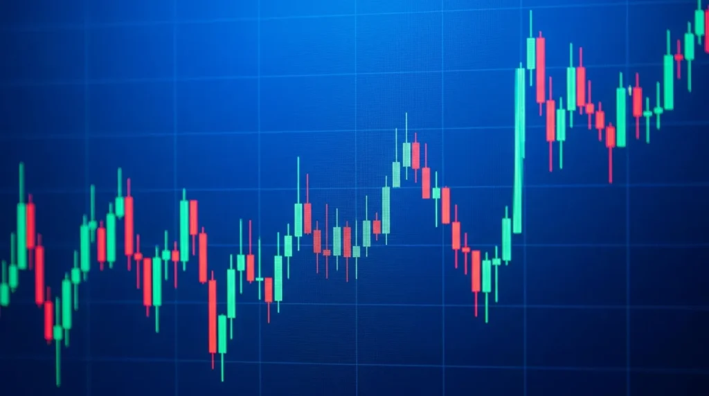
A candlestick chart is a visual way to display the price movement of a currency pair over a specific time period. Each candlestick represents one period which could be 1 minute, 1 hour, 1 day, or even 1 month depending on what you select on your trading platform. The timeframe you choose does not change how candlesticks work, only the scale of what you are looking at.
The candlestick format originated in Japan hundreds of years ago when rice traders needed a way to track price movement visually. These traders discovered that seeing the opening price, closing price, highest price, and lowest price together told a complete story about supply and demand. Modern forex traders use the exact same concept today.
Why are candlesticks better than other chart types?
A line chart only shows the closing price, which means you miss valuable information about where price tried to go. Candlesticks show the entire price range within that period, revealing where buyers fought back against sellers and where strong support exists. This additional information helps you read market psychology.
The Four Parts of Every Candlestick
Every single candlestick contains four key prices. Learning what each one represents is essential before you can read any chart properly.
The Opening Price
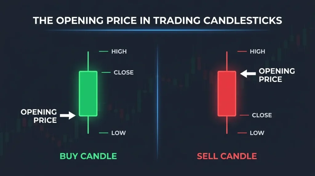
The opening price is exactly where the period started. If you are looking at a one hour candlestick on the EUR/USD pair, the opening price is what the exchange rate was at the beginning of that hour. On a daily chart, the opening price is where the market opened that morning.
The opening price forms one edge of the candlestick body. For candles that close higher than they opened, the opening price is at the bottom of the body. For candles that close lower, the opening price sits at the top of the body.
The Closing Price
The closing price is where that period ended. This is what the market rate was when that time period finished. The closing price is critical information because it tells you whether buyers or sellers were stronger during that entire period.
If the closing price is above the opening price, buyers were in control and the candle will be green. If the closing price is below the opening price, sellers were in control and the candle will be red. This simple rule applies to every candlestick on every chart.
The High Price
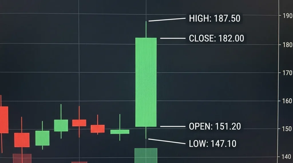
The high price is the absolute highest point the currency pair reached during that period. If EUR/USD touched 1.0900 at any moment during a one hour candle, then 1.0900 is the high. Price may have only touched that level briefly before reversing down.
The high price matters because it shows you where strong selling pressure exists. When price reaches the high, sellers often step in and prevent it from going higher. This rejection at the high becomes important when you identify patterns.
The Low Price
The low price is the absolute lowest point the currency pair reached during that period. If EUR/USD dipped down to 1.0850 during that same hour, then 1.0850 is the low. Like the high, the low may have been just a brief touch before price reversed back up.
The low price shows where buying support exists. When price reaches the low, buyers often defend that level and prevent it from going lower. These low prices become important support levels that traders watch carefully on future candles.
Understanding Green Candles and Red Candles
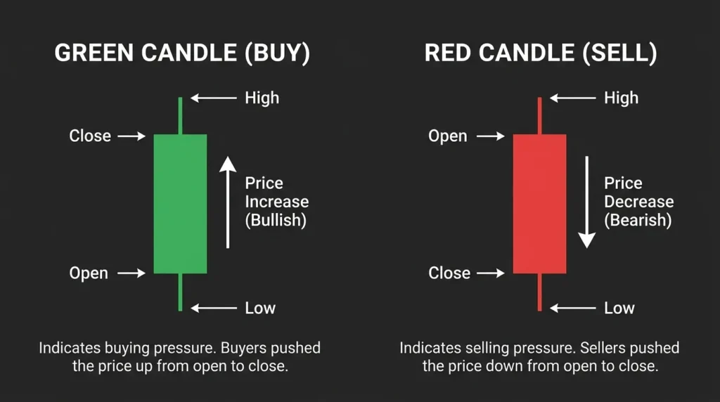
A green candlestick is called a bullish candle because it closes higher than it opened. This means buyers pushed price upward during that period and won the battle against sellers. On most platforms, green is the default color for bullish candles.
A red candlestick is called a bearish candle because it closes lower than it opened. This means sellers pushed price downward during that period and won the battle against buyers. Red is the standard color for bearish candles on most trading platforms.
When you look at a chart full of green candles, you are looking at an uptrend. When you see many red candles in a row, you are looking at a downtrend. This visual pattern is immediately recognizable once you understand what the colors mean.
The size of the candle body matters significantly. A large green body means the difference between open and close was big, showing strong buying pressure throughout that period. A small green body means open and close were very close together, suggesting less conviction from buyers.
Similarly, a large red body shows strong selling pressure while a small red body shows weaker selling conviction. When you see a green candle with a very small body, it tells you buyers struggled to push price higher despite having control. This is often a warning sign that buying strength is fading.
What the Wicks Tell You About Price
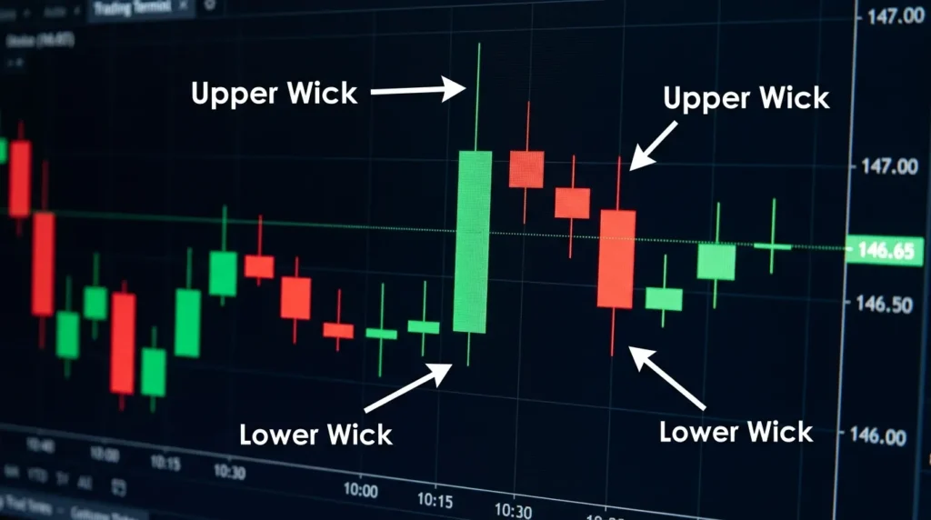
The wicks are the thin lines extending above and below the body of a candlestick. They look like hair or threads coming out of the solid body. Wicks are extremely important because they reveal price rejection and support that the body alone cannot show you.
Understanding Upper Wicks
The upper wick extends from the top of the body up to the highest price reached during that period. If you see a green candle with a long upper wick, it means price rallied much higher than the closing price but sellers pushed it back down. This tells you there is strong selling pressure at higher prices.
A long upper wick on a red candle is even more significant because it shows buyers tried to defend and push price higher, but sellers were too strong. This kind of rejection is often seen at resistance levels where selling pressure historically appears.
Understanding Lower Wicks
The lower wick extends from the bottom of the body down to the lowest price reached during that period. A green candle with a long lower wick shows that sellers pushed price down sharply, but buyers defended aggressively and pushed it back up. This reveals strong buying support at lower prices.
A long lower wick on a red candle shows sellers pushed price lower, suggesting selling strength. However, that long lower wick also indicates that buyers stepped in at that lower level and provided support. Professional traders pay close attention to these lower wicks because they reveal where strong buying pressure exists.
How Wicks Reveal Market Psychology
When you see multiple candles with long upper wicks, it tells you that traders keep trying to buy at higher prices but keep getting rejected. This is a warning that the uptrend might be weakening. Conversely, multiple candles with long lower wicks suggest strong buying support at lower prices, which often means the uptrend will continue.
The wicks are where professional traders hide their information. A single number like a closing price tells you almost nothing. But a wick tells you that traders fought at a specific price level and lost the battle. This is invaluable information for predicting what happens next.
Real World Example: Reading EUR/USD Price Action
Let us look at a practical example using actual price movement patterns you will see on any trading platform. Imagine you are looking at a four hour chart of the EUR/USD pair on a normal Wednesday afternoon.
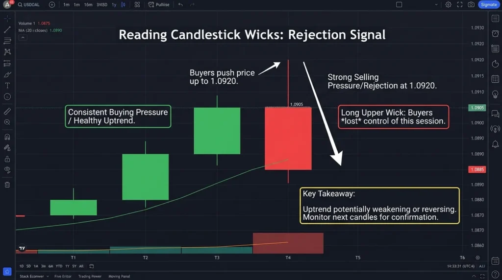
You see three green candles in a row. The first closes at 1.0875, the second at 1.0890, and the third at 1.0905. Each candle has a small upper wick and small lower wick. What is this telling you? This series shows consistent buying pressure with minimal selling resistance. Buyers are in control and moving price higher in an orderly way. This is what a healthy uptrend looks like.
Now the fourth candle opens at 1.0905 and closes at 1.0885. It is red. But it has a very long upper wick extending to 1.0920. What does this mean? Buyers tried to push price to 1.0920, but sellers showed up and rejected that price level. The buyers lost the battle that period, resulting in a red candle. This single candle suggests the uptrend might be weakening or reversing.
This is why reading wicks is more important than reading bodies. If you only looked at the closing price of 1.0885, you might think selling dominated completely. But the upper wick extending to 1.0920 tells you that buyers did fight hard and the picture is more complicated. The next few candles will determine if sellers maintain control or if buyers regain strength.
The Most Important Candlestick Patterns
While understanding individual candles is important, certain patterns of candles repeated together have special meaning. These patterns appear regularly and can signal potential price moves. Here are the four most important patterns every beginner should recognize.
The Hammer Pattern
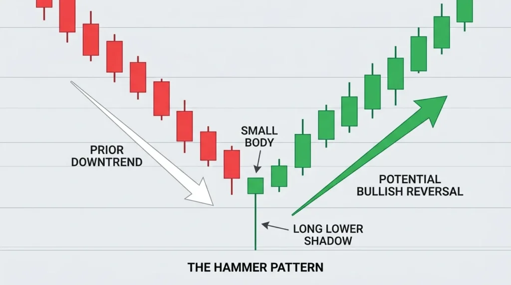
A hammer candlestick has a small body near the very top, a long lower wick, and little or no upper wick. Visually it looks like a hammer or a lollipop with the stick hanging below. Hammers typically appear at the bottom of downtrends where price has been falling.
What a hammer tells you is this: Sellers pushed price down sharply, creating the long lower wick. But buyers stepped in aggressively and pushed price back up, closing the candle near the top. This shows buyers defending a level and rejecting lower prices. Hammers often signal that a downtrend is about to reverse into an uptrend. Traders watch for hammers at important support levels.
The Doji Pattern
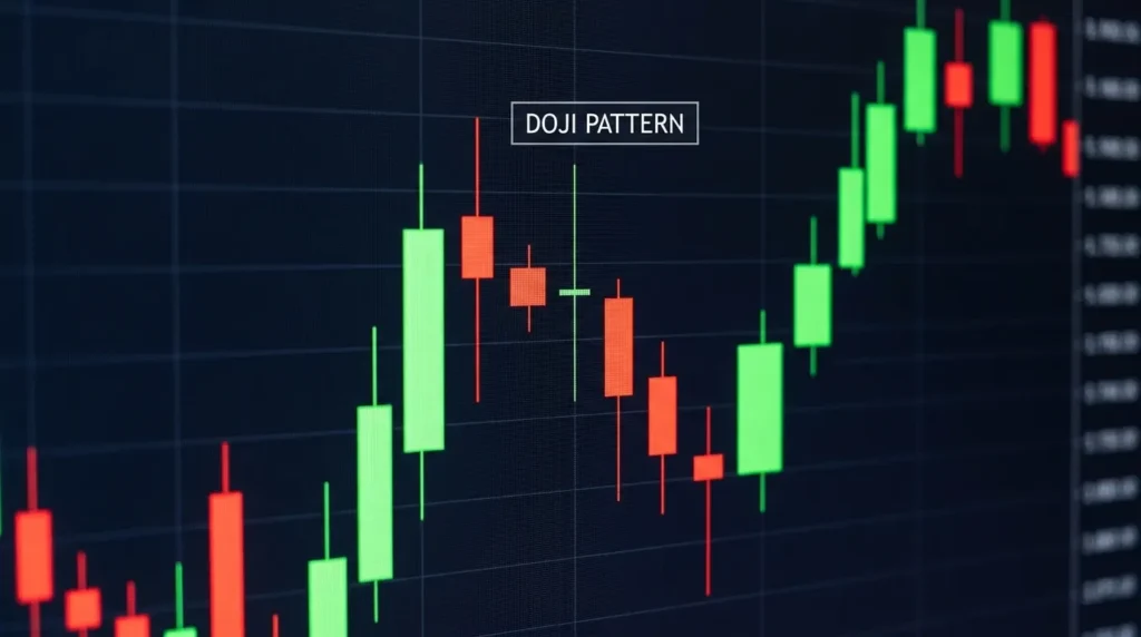
A doji is a candlestick where the opening price and closing price are nearly identical or exactly the same price. The body appears as just a thin line. Dojis usually have wicks extending both above and below in roughly equal lengths. The name comes from Japanese and means something like indecision.
What a doji tells you is that neither buyers nor sellers won during that period. Price started at one level and ended at nearly the exact same level, meaning no team made progress. Dojis often appear at turning points in the market where traders are confused about direction. They signal caution and potential reversals. A doji at a key support or resistance level is particularly meaningful.
The Engulfing Pattern
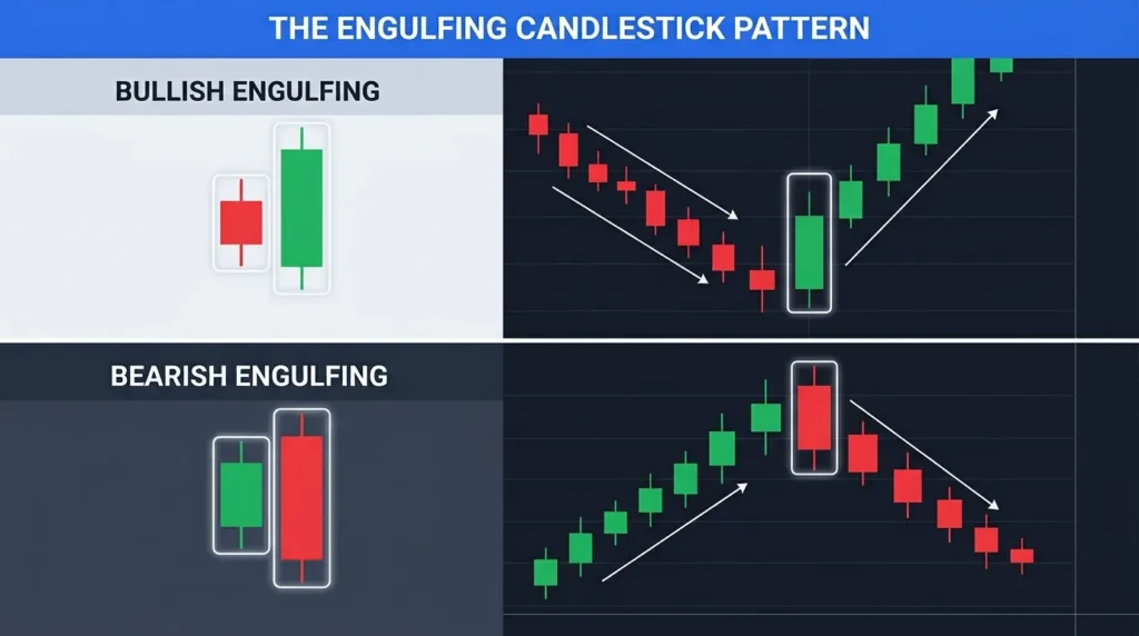
An engulfing pattern uses two candles instead of one. The second candle completely engulfs or contains the first candle. The body of the second candle must be larger and extend beyond both the high and low of the first candle.
A bullish engulfing shows a red candle followed by a larger green candle that engulfs it completely. This signals buyers taking control from sellers. A bearish engulfing shows a green candle followed by a larger red candle that engulfs it. This signals sellers taking control from buyers. Engulfing patterns often precede strong price moves because they show one side winning decisively.
The Harami Pattern
A harami is the opposite of an engulfing pattern. The second candle is much smaller and fits completely inside the body of the first candle. The second candle is entirely contained within the range of the first candle.
What a harami tells you is that momentum is slowing down. After a big move in one direction, the next candle shows less conviction and less movement. This often appears before a reversal or pause in the trend. Traders see a harami as a warning that the strong directional move is losing energy.
How to Spot Trends Using Candlesticks
One of the most valuable skills with candlesticks is learning to identify whether the market is trending up, trending down, or moving sideways without a clear trend. This skill develops through practice and looking at many charts.
Identifying an Uptrend
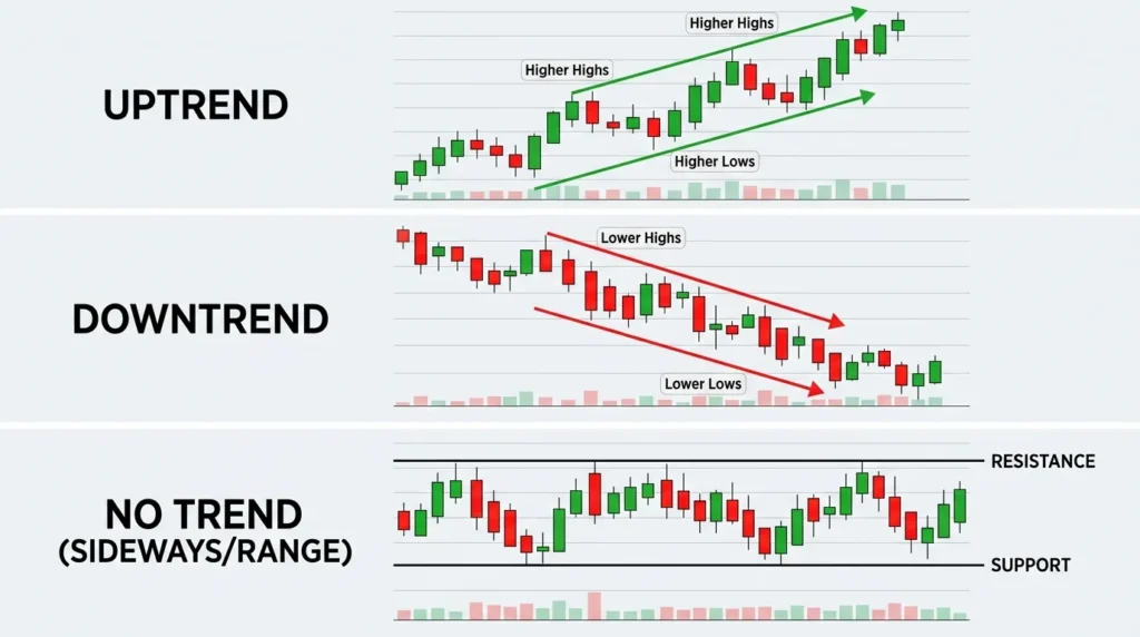
In an uptrend, you see more green candles than red candles overall. More importantly, each swing high is higher than the previous swing high, and each swing low is higher than the previous swing low. The pattern stair steps upward as you move from left to right on the chart. The overall visual shape tells you buyers are in control and price is moving higher over time.
Identifying a Downtrend
In a downtrend, you see more red candles than green candles. Each swing low is lower than the previous swing low, and each swing high is lower than the previous swing high. The pattern stair steps downward from left to right. The overall shape shows sellers are in control and price is falling over time.
Identifying a Range Bound Market
In a range bound market, price bounces between a high level and a low level repeatedly. Neither buyers nor sellers are winning decisively. You see candles hitting the high level, reversing lower, then hitting the low level and reversing higher again. Price stays trapped between two prices with no clear direction.
The skill of reading trends comes with practice looking at real charts. Professional traders can glance at a chart for three seconds and immediately identify if they are looking at an uptrend, downtrend, or range bound market. This speed comes from seeing hundreds of examples. You will develop this same ability through patient observation.
Candlesticks on Different Timeframes
The same candlestick principles apply whether you are looking at a one minute chart or a monthly chart. However, the importance and reliability of patterns changes dramatically based on which timeframe you choose.
Why Timeframe Matters
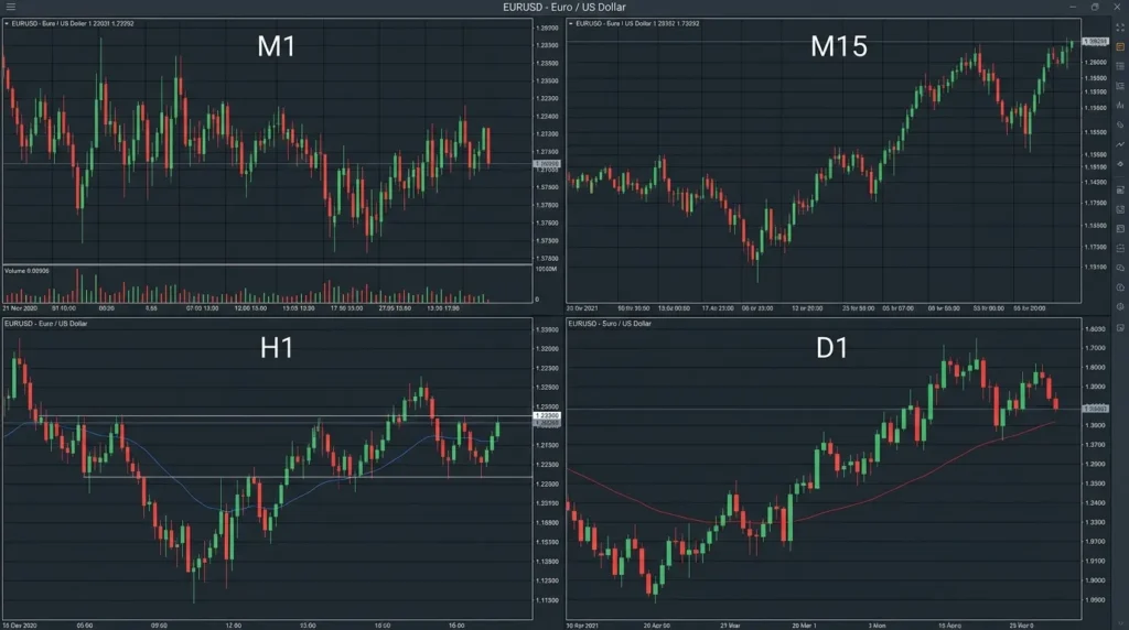
A hammer appearing on a daily chart is far more significant than a hammer appearing on a one minute chart. Why? Because a daily candlestick represents 24 hours of trading from thousands of traders worldwide. A one minute candlestick represents just 60 seconds of trading. A pattern that takes a full day to form carries much more weight than a pattern forming in one minute.
Think of it like this: a one minute hammer could be noise or a random blip. But a daily hammer shows that buyers defended a price level throughout an entire trading day against all the selling pressure that occurred. This carries real meaning.
Using Multiple Timeframes Together
Professional traders use multiple timeframes together to get a complete picture. A trader might look at a daily chart to identify the main direction of the trend, then switch to a four hour chart to find the best entry points, then check a one hour chart to confirm their timing. This layering of information gives confidence.
If you are new to trading, start with daily or four hour charts. The patterns are clearer and less noisy. You have more time to think and react to what you see. Once you gain experience and confidence, you can explore lower timeframes. But the fundamental principles of reading candlesticks remain exactly the same on all timeframes.
Mistakes Most Beginners Make
Beginner traders make predictable mistakes when reading candlesticks. Awareness of these errors helps you avoid them and progress faster than most traders.
Ignoring the Wicks
Many beginners focus only on the body of the candle and completely ignore the wicks. They see a red candle and think it means pure selling. They miss the long lower wick showing that buyers defended strongly. This incomplete reading of candlesticks leads to wrong conclusions about what the market is doing.
Ignoring the Larger Context
A hammer is bullish in a downtrend, but the same pattern might mean nothing if it appears in the middle of a strong uptrend. Candlestick patterns are only reliable when understood within the larger trend context. Always ask yourself: what is the bigger picture? Am I in an uptrend or downtrend? Patterns matter more at turning points than in the middle of trends.
Trading Single Patterns Without Confirmation
Some beginners see a doji or a hammer and immediately enter a trade. Professional traders wait for confirmation. They want to see the pattern actually work as intended before putting real money at risk. A bullish hammer should be followed by price moving higher to confirm the pattern worked.
Ignoring Support and Resistance Levels
A bullish pattern appearing at a major resistance level is less reliable than the same pattern appearing at a support level. The larger price levels matter. A hammer at strong support is much more likely to work than a hammer in the middle of a price range.
Expecting Patterns to Work Every Single Time
Candlestick patterns are not perfect signals. A hammer does not always precede a rally. A doji does not always precede a reversal. These patterns improve your odds but they are never guaranteed. This is why risk management is absolutely essential. Never risk more than you can afford to lose on a single trade.
Questions Traders Ask Most
Why are candlesticks better than line charts?
A line chart connects closing prices with a single line, showing only where price ended each period. A candlestick shows the opening price, closing price, highest price, and lowest price all at once. This extra information reveals where price struggled and where support or resistance exists. For serious traders, candlesticks provide far more actionable information than line charts.
Can candlestick analysis work on cryptocurrencies and stocks?
Yes. Candlestick analysis works on any market that displays open, high, low, and close data. Bitcoin, Ethereum, Apple stock, gold, oil, and indices all use candlesticks. The principles are identical across all assets. Once you master candlestick reading on forex, you can apply the same skills to any market.
What timeframe should beginners use to learn candlesticks?
Start with daily or four hour timeframes when you are learning. These timeframes show clearer patterns with less random noise. You have more time to analyze carefully before making decisions. Once you understand candlestick fundamentals well, you can explore lower timeframes like hourly or 15 minute charts. Avoid very low timeframes like one minute or five minute charts until you have real experience and skill.
Do I absolutely need to know candlestick patterns to make money?
Candlestick pattern recognition helps but is not absolutely required. Some successful traders use price action alone without formally naming patterns. Others combine candlesticks with moving averages, stochastic oscillators, or support and resistance levels. The key is truly understanding price movement fundamentally. You can succeed without memorizing pattern names, but you cannot succeed without understanding what candlesticks show you.
How many candlesticks should I study before trading real money?
There is no magic number. As a basic guideline, study charts for at least two to three weeks before trading real money. Paper trade using a simulator or demo account for at least one full month. This builds real familiarity without risking actual capital. Most traders need 500 to 1000 hours of chart analysis before they develop reliable pattern recognition and intuition.
Do candlestick patterns work the same in all markets?
The mechanics work the same everywhere, but frequency differs. A hammer appears very frequently in forex, which trades 24 hours with different sessions. The same pattern might be less common in stock markets which have fixed opening and closing times. Study the specific market and timeframe you plan to trade. Patterns that work constantly in one market might be rare in another.
Financial Disclaimer and Risk Warning
IMPORTANT DISCLOSURE: This article is educational content only and does not constitute financial advice or a recommendation to trade any currency pair. This information is provided for learning purposes and may not be suitable for your individual circumstances.
Risk Warning: Forex trading involves substantial risk of loss. The leverage available in forex trading means that losses can exceed your initial deposit. Under United States regulations, the Commodity Futures Trading Commission (CFTC) limits retail trader leverage to 50 to 1 on major currency pairs. This means a trader with a 1,000 dollar account can control positions worth up to 50,000 dollars. A small adverse price movement can wipe out your entire account very quickly.
Leverage Risk: If you use 50 to 1 leverage and the currency pair moves against you by just 2 percent, you lose 100 percent of your account. This is not a theoretical concern but happens regularly to traders who do not respect leverage risk. Never risk more than you can afford to lose completely.
Past Performance: Past performance is not indicative of future results. A candlestick pattern that worked perfectly in the past may not work the same way in the future. Market conditions change. Liquidity changes. New traders entering or leaving the market change dynamics. Geopolitical events and economic data releases can cause unexpected gaps.
Before Trading Real Money: Ensure you have a written trading plan that includes position sizing, stop loss placement, and profit targets. Trade only with a demo account or very small real money until you have proven consistent results. Never risk money you cannot afford to lose. Consider consulting with a financial advisor about your individual situation.
Candlestick Analysis Limitations: Candlestick analysis is one tool among many. It is not a substitute for comprehensive risk management, proper position sizing, and a complete trading strategy. No analysis method is 100 percent accurate. All trading involves risk.
Affiliate Disclosure: ForexToolboxPro may earn affiliate commissions from recommended tools and platforms. However, all recommendations are made objectively based on merit. Commissions do not influence which tools or platforms are recommended.
Conclusion and Next Steps
Reading candlestick charts is a foundational skill that separates casual traders from serious ones. You now understand what each part of a candlestick represents, what information the wicks reveal about price rejection and support, and how patterns form across multiple candles to signal potential price moves.
The knowledge is one thing. Actually using it on real charts is where the real learning happens. Your next step is to open a demo trading account with any major broker and start looking at real candlestick charts. Do not trade yet. Just observe and practice.
When you open a daily chart of the EUR/USD pair, practice identifying whether you are in an uptrend or downtrend. Look for hammers, dojis, and engulfing patterns. Try to predict what the next candle will do based on what you see. Write down your predictions. Then advance the chart and check if you were correct. This simple exercise builds intuition faster than anything else.
Spend at least one month observing charts and making predictions without risking any money. Keep a practice journal documenting the patterns you find and what happened next. This builds the pattern recognition that professional traders rely on. Once you have filled a journal with observations and predictions, you will have developed real competence with candlestick reading.
After successful paper trading for one month, you can then consider trading real money with a very small account position. Start with one micro lot or the smallest position your broker allows. Trade only one currency pair. Apply everything you learned here about candlesticks and risk management. Most importantly, never risk more than 1 to 2 percent of your account on any single trade.
Remember that even professional traders with decades of experience sometimes misread candlestick patterns. The goal is not perfection but improvement. Candlestick analysis improves your odds of success. It does not guarantee profits. Always trade with proper risk management and discipline.
